Well my little family is harbouring germs at the moment….STEER CLEAR….. and have been for the last week and a half. So apart from using about 10 boxes of tissues, not much has been happening around here, hence the lack of posts….Sorry!
Wanting to get something done, I was inspired by my upline MARELLE to go back and complete some of the challenges from the Elite Challenge Blog. It was a no brainer really. The sketch was already there for me, I just needed to choose the colours. You can find the Sketch Challenge HERE. And this is what I came up with…..

I’ve used a stamp set from the new autumn-Winter Mini Catalogue, its called Vintage Vogue, and it my equal favourite with the Medallion Stamp.


I stamped an extra ‘F’, cut it out and mounted it on foam dimensionals to give it a 3D effect. I’ve also added a few of the dimensionals to the white circle, to raise it above the So Saffron coloured circle. You may not be able to tell from the photo, but the vines around the edge of the card have been clear embossed and the white straight piece of card stock has been through the crimper.
ENJOY
Supplies:
Inks: Versamark, Baja Breeze, So Saffron
Cardstock: Baja Breeze, Whisper White, So Saffron
Stamp Set: Vintage Vogue
Other: Sponge Daubers, Pearls (Pretties Kit), Eyelet Border Punch, Crimper, Clear Embossing Powder, Heat Gun, Circle Scissors


 I did originally have all 3 butterflies in Regal Rose, but decided while I was taking the photos, that one of them needed to be a different colour. I did try using So Saffron, but it seemed a little washed out. I think the Kiwi Kiss works well. I also had all of the butterflies wings curled up but decided just to keep the focus on the centre butterfly and only curl those ones.


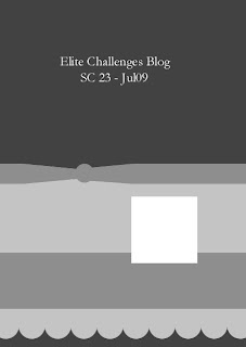


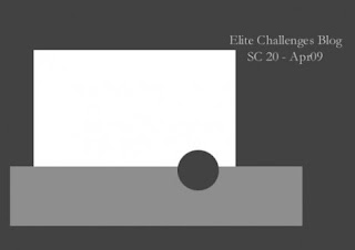


 and this is my take on the sketch
