Firstly I just wanted to clarify Monochromatic:
Monochromatic color schemes uses variations in lightness and saturation of a single color. This scheme looks clean and elegant. Monochromatic colors go well together, producing a soothing effect. The monochromatic scheme is very easy on the eyes. The primary color can be integrated with neutral colors such as black, white, or gray*
Todays Monochromatic colour is ‘Brilliant Blue’ from the Bold Brights colour family. This card is inspired by the Elite Challange Blog -February Sketch Challange. This is the sketch
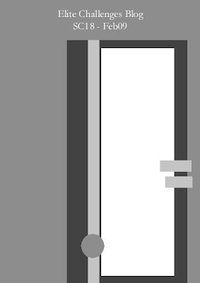 and this is my take on the sketch
I must say that this card is much more glittery in real life, its hard to capture the sparkle on camera, and trust me when I say its SPARKLES! The Stampin Glitter has some serious sparkle to it. You will probably be seeing much more of it in future posts. Its an ultra fine glitter that makes any project shine. I used it with the Heat and Stick powder. I also used the crop-a-dile to set the eyelets, but I am going to do a review on this tool later this week.
If you are looking for some more info on colour schemes, this is a great website
Supplies
Cardstock: Whisper White, Brilliant Blue
Stamps: Baroque Motifs
Ink: Brilliant Blue, VersaMark
Accessories: White Eyelets, Heat & Stick, Stampin Glitter, Dimentionals, Crimper, Large Oval Punch, Corner Rounder, DS Paper, Dimensionals, Crop-a-Dile
